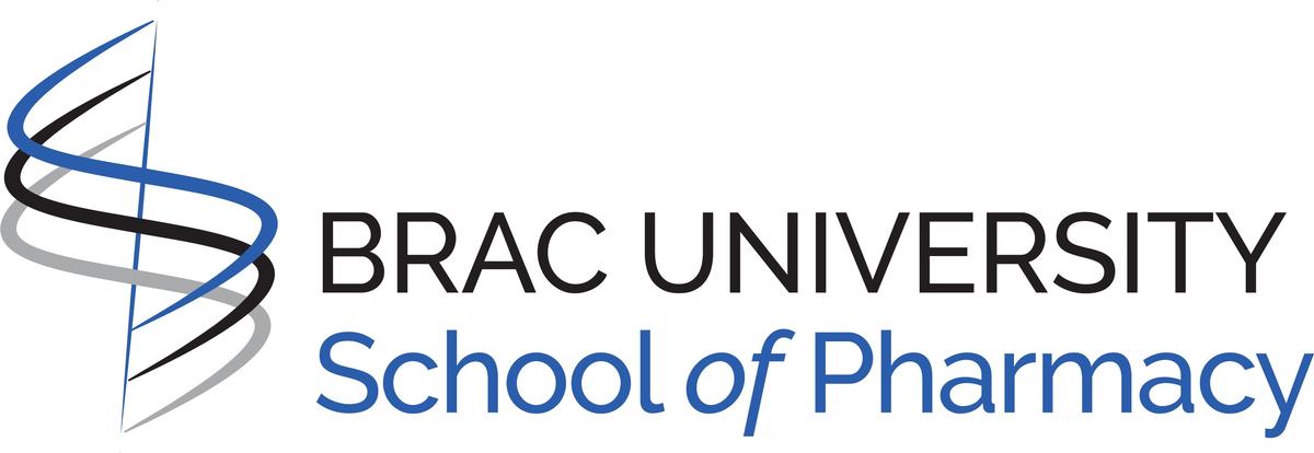
The logo of the School of Pharmacy has been formed by carefully placing three equal-sized spiral elements surrounding a vertical pole, wrapped in colors derived from the emblem of Brac University. The shape of the letters, which spell out the School's title, has been balanced to emphasize clarity and confidence. Each of the three spiral elements represents the different layers of knowledge the School encourages its graduates to attain and ponder upon.
The top-most element, colored blue, represents the first layer of knowledge, which is 'knowledge for health.' The color blue represents trustworthiness and reliability, which can be highlighted as two of the most important characteristics associated with pharma/medicine in modern times.
The second element representing 'knowledge for humanity' has been colored black to delineate the intellectual strength the School envisions instilling in its graduates to prepare the changemakers of tomorrow.
The spiral element at the bottom represents 'knowledge for habitat.' The color silver represents innovation and modernity, fostered by the School through impactful research, resulting in the community's well-being while broadly promoting a healthier habitat for all.
The spiral elements designed to depict the shape of stairs, along with the vertically-slanted pole, indicating upwards, outlines the path students are encouraged to cover to explore the infinite horizon of knowledge, whose vastness can be compared to the sky.
Simultaneously, the symbolic representation of the spiral elements can be traced to that of a tree, portraying - no matter how knowledgeable a person is, they should always stay attached and give back to their roots - humanity and habitat, to contribute to the sustainability of the ecosystem.